Leading a Student Platform to the Next Level
Jessica Loredo
Dec 2nd, 2022
Summary: Bringing engagement and focus to the student experience
This case study covers the journey of an exciting opportunity with a well-known EdTech brand. In short, they wanted to elevate the user experience for their learner platform. As a content-first company they have a robust content library. However, they had recently entered the EdTech industry, so their learning platform was still in its infancy.
I used over 10 different user experience activities to help me solve problems and find solutions in my design process for this case study which I explain further below. Some of the activities I used were design workshops (empathy mapping, pain points mapping, and crazy 8s), low-fi and hi-fi wireframing, prioritization matrix, and prototyping and analyzing usability study feedback.
The feedback from the field was that students struggled to know where they were supposed to go, how to find meaningful or fun content, and the overall purpose of the platform. The interface itself felt dated and geared towards an adult audience rather than developmentally appropriate for any particular grade (or grade band). I worked closely with a team of developers, product managers, and subject-matter experts to craft a new experience that had educators and students excited for the new school year and resulted in an increase in usage and return visits! Read more below.
Students need a simpler, focused, and more engaging platform to access assignments and explore new and exciting content.
Persona Writing, Competitive Analysis, Journey Mapping, Heuristic Evaluation, Design Workshop, Problem Statement Writing, Prioritization Matrix, IA, Wireframing, UI Design, Protoyping in Figma, Usability Test Plan Writing and interpertation of data
By entering the password below, you agree that you are viewing this case study as a hiring manager or potential client only. None of the data presented is authorized to be published anywhere else beyond this site without permission. Type "uxjesi" in the box below to read more. Having issues? Use the contact form to ask questions.
Key Problems: Usability, Engagement, and Usage
Often, defining the problem is the most difficult part of the process. It gets skimmed over due to time constraints which can lead to designers jumping straight into the solution phase. Understanding the problem space is a big part of my design process (and the most impactful). Here are some early questions that I sought to solve throughout my process.
- Questions I'm Asking:
- Who are our customers? Who is our target audience and is the platform appropriately targeting this audience and driving the level of growth we want?
- How do our customers feel about our platform right now? What are their biggest pain points?
- Who are our biggest competitors? What are they doing right? What are they doing wrong?
- What is the vision for the future of our platform?
- How will I know which problems are the right problem to solve first?
- What constitutes failure? What is our measure of success?
You'll notice that these are pretty common questions for any large-scale UX project. And while some of the answers may seem obvious, it's important to review and look for any gaps or assumptions based on incorrect data or biases.
At this point I've done very little in terms of solutioning and that's intentional! I do my best to spend as much time on understanding the problem space as I do design and development work. I started to get a pretty good picture for this project. We wanted to improve usability, increase engagement, and drive more usage and repeat users. Could we refine that? Absolutely, continue on to read on to learn more about my process.
Audience: Students, Educators and Potentially Parents (In that order)
While this platform targeted both educators and students, the student experience did not have the same level of investment as the educator experience. That left it feeling rather flat, boring, and unfocused to students. While most traffic to the platform was through educators (assigning content to students), the assignment flow was somewhat confusing. Furthermore, there was no differentiation between a kindergarten experience and a high school experience. And while most users were in the 3-5 or 6-8 grade range, the outer edges of those bands (K-2, 10-12) were getting a poor experience in contrast to the middle bands.
Team Structure: Agile/scrum team with UX up-front
Our team used scrum/agile methodologies daily. Product managers and owners work with the designer to define the problem, create wireframes, concepts, mockups and prototypes. We complete the bulk of that work before hand-off to development. During the iterative phase we seek feedback early and often to refine our ideas. At about 80% completion we get ready to hand off our designs to development. As a designer, I continue to work with development to refine the design live in pre-production environments. The sprint team works in two-week sprints and tracks tasks on a scrum board managed by our scrum master. We had daily standups to highlight any roadblocks or areas where I might need to step in and help adjust designs.
Scope, Constraints, and Other Challenges: Attrition, Tech Stack, and Design Library aimed at adults
I was new to the company, so my biggest constraint was understanding the capacity and ability of the development team. Unfortunately, the company suffered from quite a bit of turn over. I had worked there three months and had three different product managers and had already seen one designer leave the team (with two more in the next six months). That's another story all together, however, those changes absolutely have an impact on the momentum of design and development.
When things finally settled down, I was paired with a team who had never worked on this part of the platform before. Their work to this point had been on a different product with a different tech stack all together. There was a lot of newness going around.
My task from the VP of design had been to "blow up" the current design. In retrospect, I would do a better job of investigating and understanding exactly what that meant. It turned out that our changing the design that radically was well out of the scope of resources and capabilities of our development team. I learned that you could blow up a design, but unless the team is willing to be innovative (meaning they have the space, time, and support to do so) - it's likely not going to happen.
The last big hurdle was that there was already a design library in place that worked very well for the educator experience. Unfortunately, it did not fit what one might consider appropriate design standards for K-12. Knowing we wouldn't be able to create K-2, 3-5, 6+ specific experiences, we had to find a middle ground. This wasn't ideal but to help safeguard against being completely inaccessible (particularly to the K-2 age range) we conducted usability studies with students in those age ranges and adjusted the design based on feedback.
Process: End to End from Analysis to Production
Let's dig in a little more into the phases of my design process. You'll notice all the varying design activities due to the end-to-end approach needed to complete the design and launch the product. The design process I used looked something like this:
- Proto-Persona Writing/Creation
- Competitive Analysis
- Journey Mapping
- Heuristics
- Design Workshop
- Problem Statement Writing
- Prioritization
- Design/Prototyping
- User Testing
- Iterating based on feedback
And of course, the best part, product release! It's a little misleading because the fun never truly ends. We continue to monitor usage and get feedback from our users so that we can continue to improve on what's there. And I'm pleased to say that this new experience made a huge splash!
Proto-Personas
One of the biggest questions you need to answer is “Who are we building this for?” Well, Students! But that’s a very broad category and given the time frame (we were aiming for back to school) we needed to be careful about the scope of the project. So we settled on a more focused group of students between 3rd through 6th grade as that was already our primary market (about 70% of our students were in grades 3-6, with about 65% of those using Chromebook).
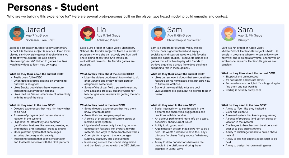
I created a few proto-personas across the K-2 grade band as the company did not already have personas created. I call these proto-personas because they are a little simpler than more fully formed personas and are easier to change. I honestly think personas are mis-used in that they are often created and then left to sit on a shelf gathering dust. I prefer to make more accessible personas that evolve as my understanding evolves.
Now that we answered the "who" we needed to focus on the where? What did our landscape or industry look like and where did we live within it?
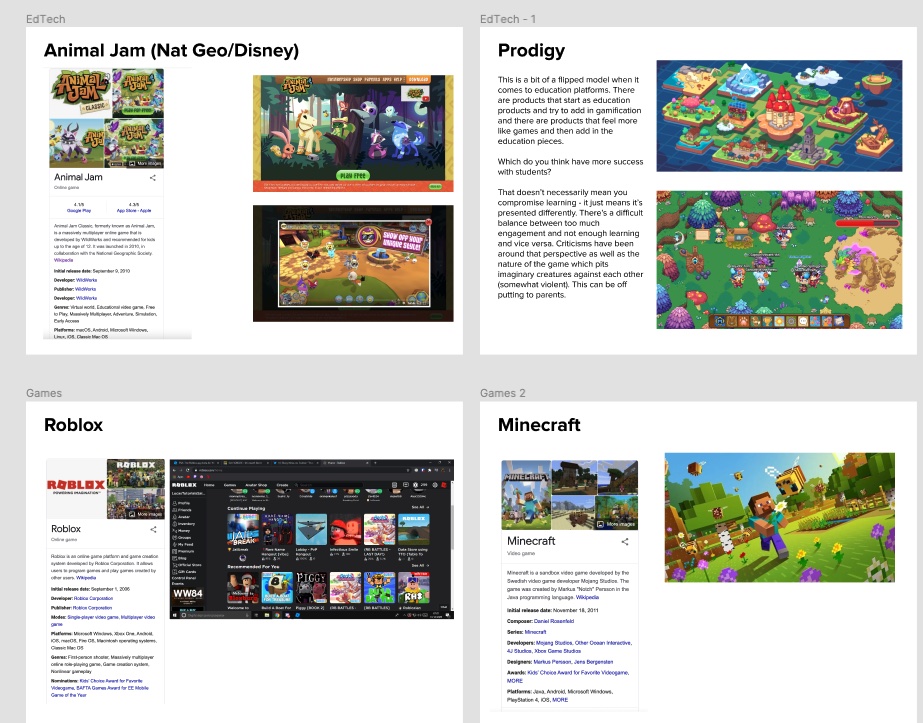
Competitive Analysis
Because of my edtech experience I was already pretty familiar with the landscape (though it feels like more and more edTech companies entering the space every day). However, it didn't mean I had reveiwed them from the perspective of product offerings (and their targets) at this company. For example EdTech companies can be separated into a few categories. Supplemental or Core, Assessments and Benchmarks, Individualized and/or Adaptive Learning, and Standards aligned. The details of what those are out of scope for this case study, but suffice to know that the VP of Design's vision was for thsi product to eventually be more individualized and adaptive.
What did we want to be? It was another question I asked to leadership that wasn’t as clearly defined as it needed to be. We settled on moving into a direction of individualization and adaptive learning, but we had a lot of work ahead of us to get there.
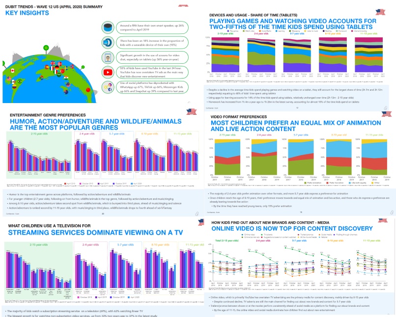
Currently, the platform was more focused on content creation or delivery than it was on being a full-formed learning platform (think, more of a YouTube rather than a Google Classrooms or Canvas). Luckily, I had just developed an individualized an adaptive learning product at a previous company, so I reviewed past materials until I felt I had a good grasp of the competitive landscape. I created a document with findings to leadership for review as well which included add'l information about companies like SeeSaw, Youtube, Edmentum, Kahn Academy and more.
We were also lucky to have a few reports from firms that studied student engagement (not necessarily our customers) in media and got a ton of fabulous information from those reports as well to use in our evaluation and analysis.
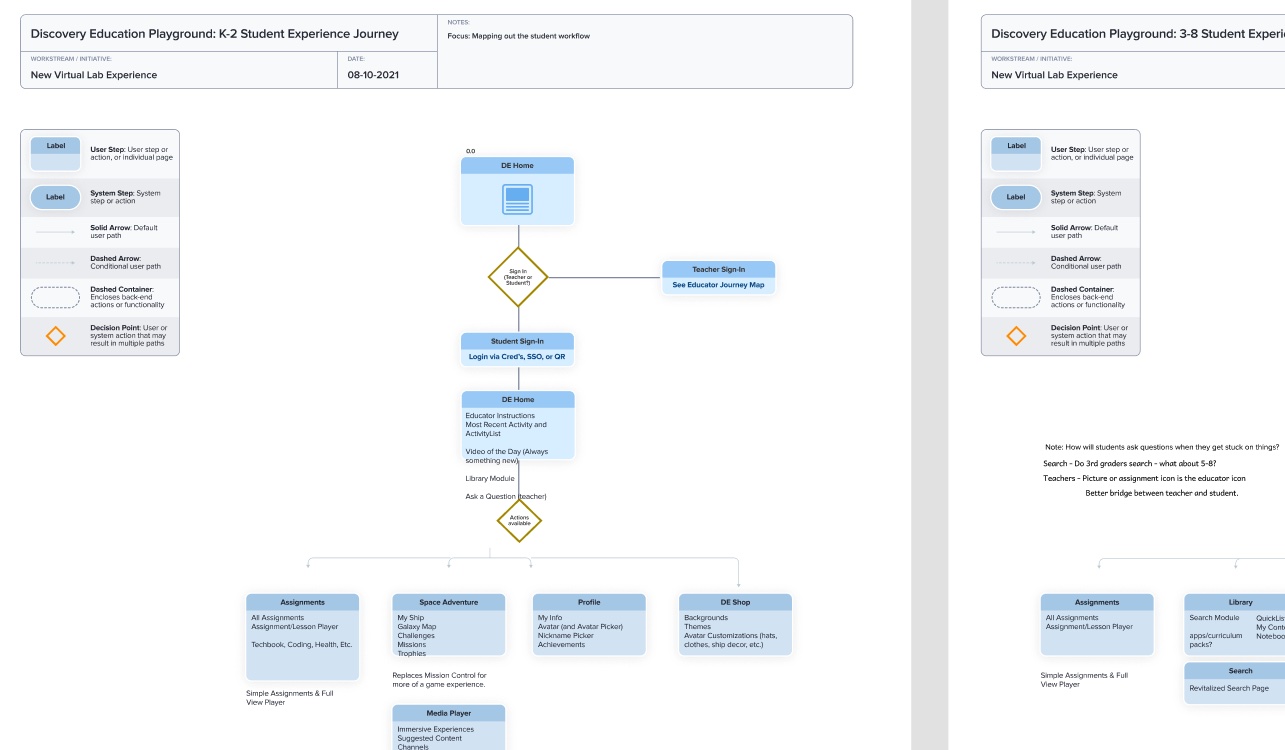
Journey Mapping
To get myself more acquainted with the current platform I created some current state journey maps from the perspective of one of our personas.
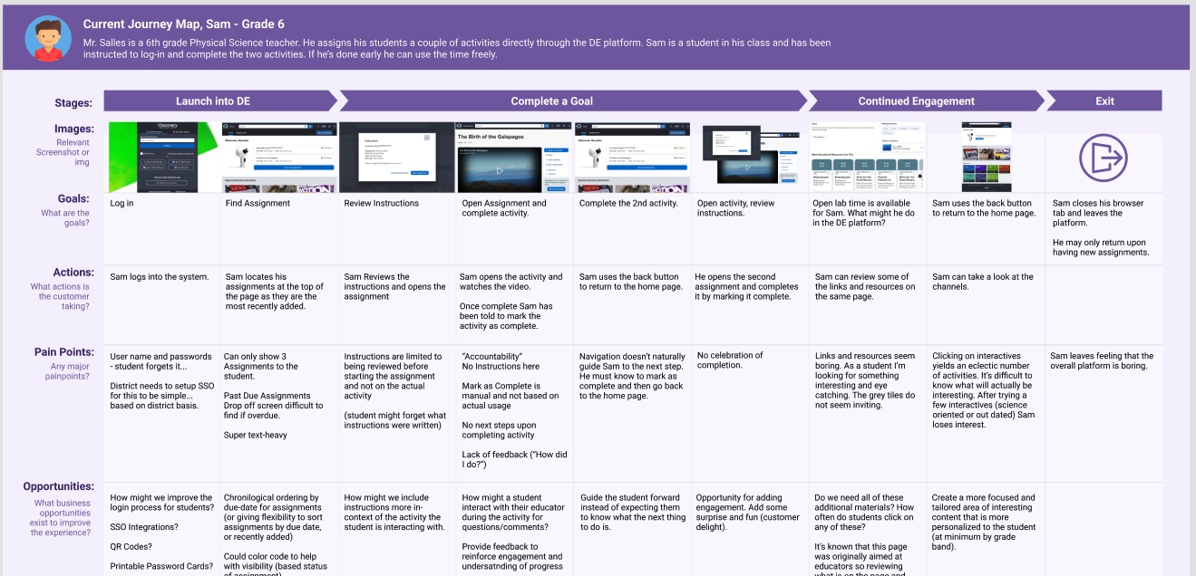
This simple exercise helps to identify primary workflows, sort of happy path experiences for the target persona. You can then focus on the areas where it seems users are getting stuck. What is the specific pain point? What opportunities exist to improve it? Is this the right workflow? Can we make this shorter? I usually capture a more high-level amount of information from exercises like these but they are also super helpful in communicating with stakeholders as well.
Heuristics
I concurrently started a heuristic evaluation. We conduct these to assess where clear usability issues exist in the current product. This is different from the journey map in that we're not really thinking about the full experience so much as we are evaluating aspects of the site for quick fixes and red flags. I used the Nielsen-Norman heuristic evaluation template for this project and I added an additional category for accessibility (particularly important in EdTech).
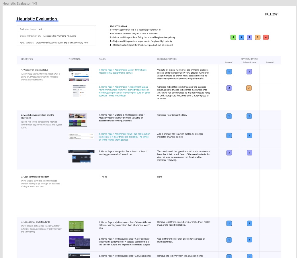
There is an area for a secondary evaluator so I recruited my product manager. This was her first time with an exercise like this but she easily saw the value. Usability can be a tricky term, so I find evals give people something tangible to evaluate for those who aren't as well versed in the UX world. I made some small recommendations within the eval and we used this to write some early tickets for the team (to develop) while I was still getting up and running on my side.
Design Workshop
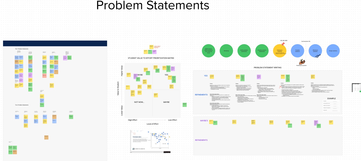
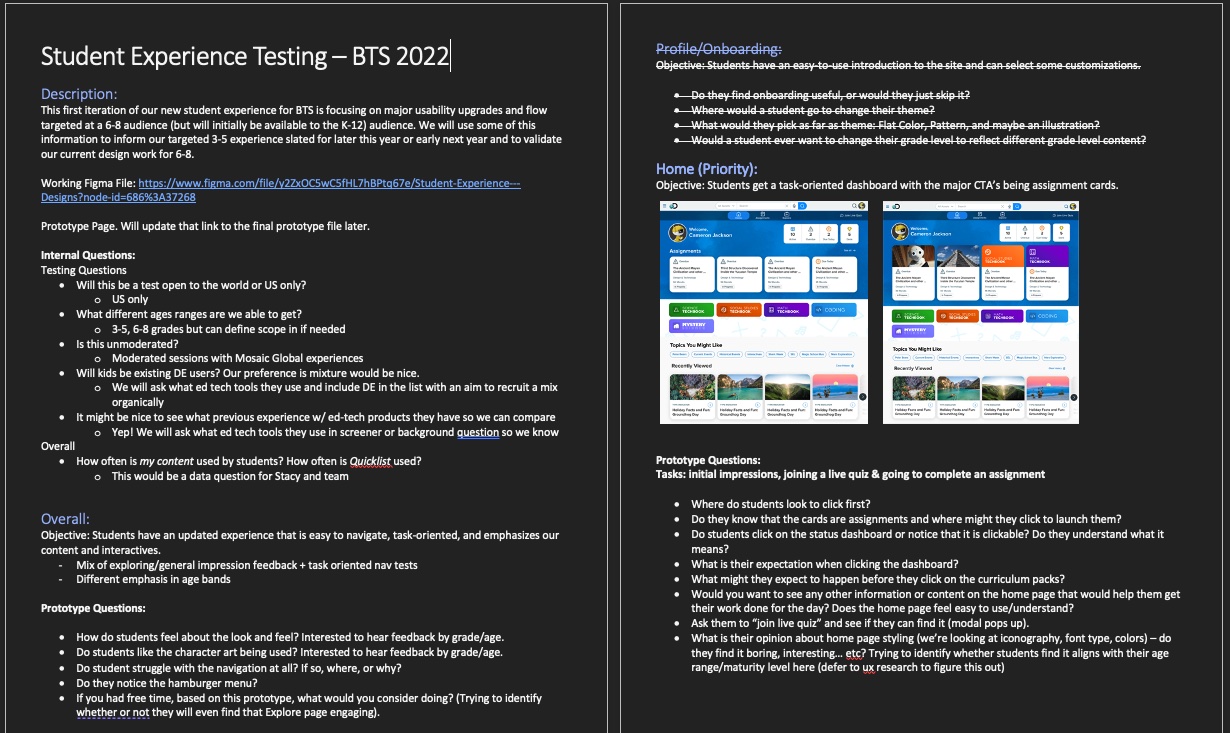
While I was conducting those smaller exercises I was concurrently writing a design workshop for some of our company stakeholders. This would give me a bigger picture of the pain points and opportunities within the product from the perspective of several different parts of the organization. I would have loved to write a workshop for students, but it was still the middle of the pandemic and it would have been quite difficult. The workshop was comprised of eight participants from around the organization (product managment, curriculum design, subject-specific experts, etc.). Our primary goal was to create empathy and discover pain points for our student users by putting ourselves in their shoes through a series of four primary exercises, Emapthy Mapping, Pain Point Discovery, How might We's?, and Crazy 8's (solutioning). Many of these come from a popular method called a "design sprint". That's a story for another time, but generally people enjoy the process and we come out with some valuable new insights.
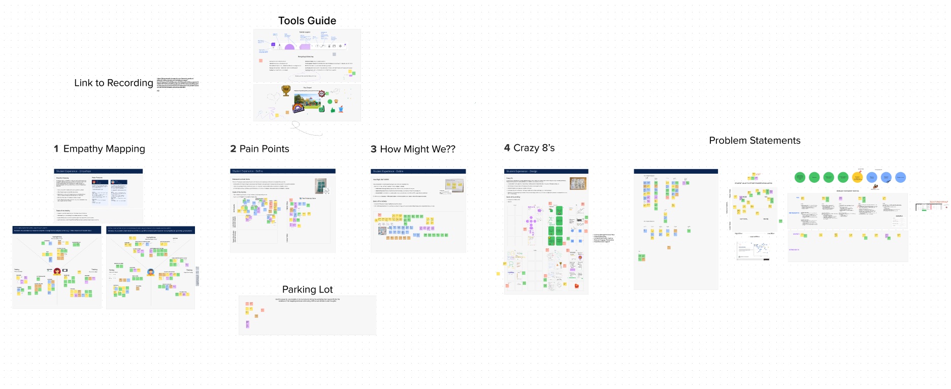
After I conducted the workshop I met up with the product manager on the product. Our goal was to further analyze and organize what we had learned and start to formulate strong themes and from there be able to write more focused problem statements. We also needed to know how we wanted to proceed once we identified the key areas of focus. I had us use a prioritization matrix.
Problem Statment Writing
We spent time organizing the sticky notes into themes and began to ask formulate more focused "How might we?" statements and similar. One of the frameworks I brought to the problem statement writing activity was the SMART framework. SMART is defined by, is it specific, measurable, actionable, relevant and time-bound? That will give you a solid foundation going forward. We used a simple template that roughly reflected those principles.
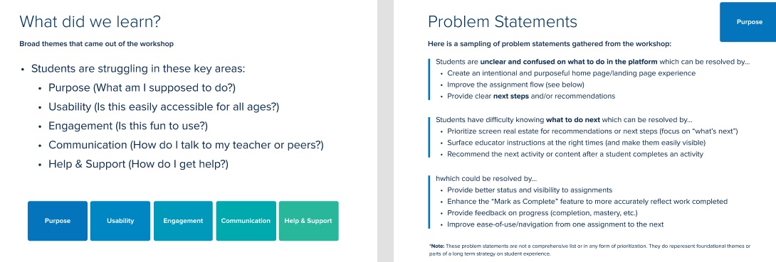
Amidst the workshop and problem statement work we started to see some clear themes emerge. I cheekily call these "The Five Pillars" and they were the areas I felt needed the most improvement for the product to be most successful. We aligned our problem statements to these broad themes in my final read-out of my workshop findings (see slide above for a snippet). The pillars were:
- Purpose: What am I supposed to do here?
- Usability: Is it easily accessible?
- Engagement: Is it fun?
- Communication: How do I talk to my teacher or peers?
- Help and Support: How do I find help?
We focused on purpose, usability, and engagement first. Purpose and usability were no-brainers. The app needed to be focused, clear in what it was meant to do, and easily accessible to K-12 students (but we were starting with 3-6 first). It might surprise you to see engagement listed as third. But for students, it was a big deal! Kids today are what we all "digital natives", they are used to high quality media and have short attention spans (low patience for waiting on things to load). We needed to have modern and common features to feel like they could make this platform thier own (by changing avatars, themes, and earning rewards).
At the bottom of the list were Communication and help and support. The platform has no notifications feature and no messaging or mail between teachers and students nor between peers. There are also zero help materials to aid students in answering questions they might have about the platform. You might think, a great experience doesn't need a help guide! I beg to differ. There will always be need for support resources especially the larger your product gets. Creating materials like that for students adds an extra layer of complexity owing to the fact that we'd need to create developmentally appropriate media.
This first release of the product we focused primarily on the first three pillars, Purpose, Usability, and Engagement. The other two would be pushed far out into the future. It's not that they weren't important, but we could only accomplish so much for this iteration and we felt the first three had the most value.
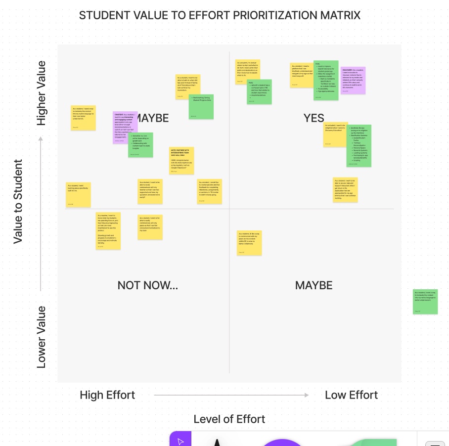
Value to Effort Prioritization Matrix
This part was more for planning and directional purposes. Now that we had some clearly defined problem statements and themes what did we start with first? I used a value to effort priority matrix to help us make that decision. This was super useful in planning feature development for both design and development. And from an emotional standpoint, I find this exercise seems to offer an improved sese of confidence!
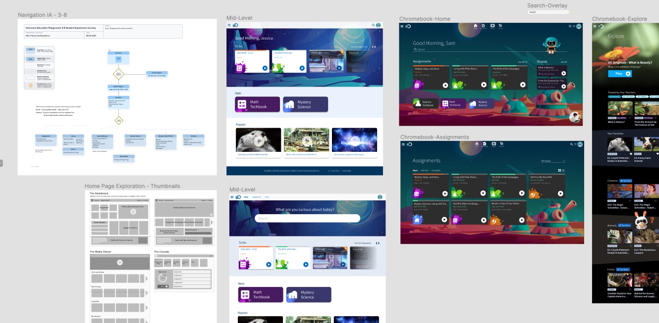
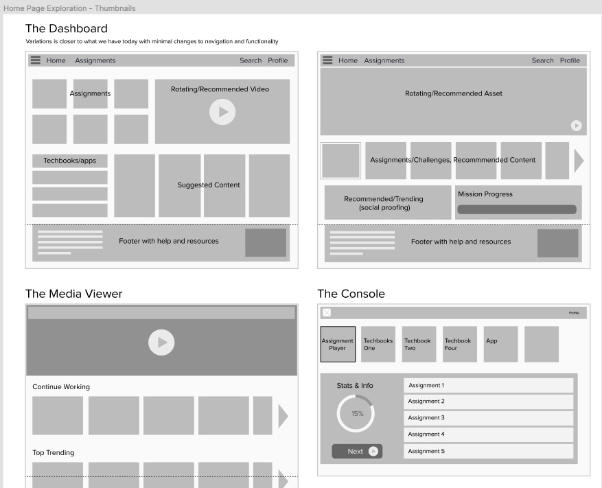
Architecture, Wireframes, Design, and Prototype
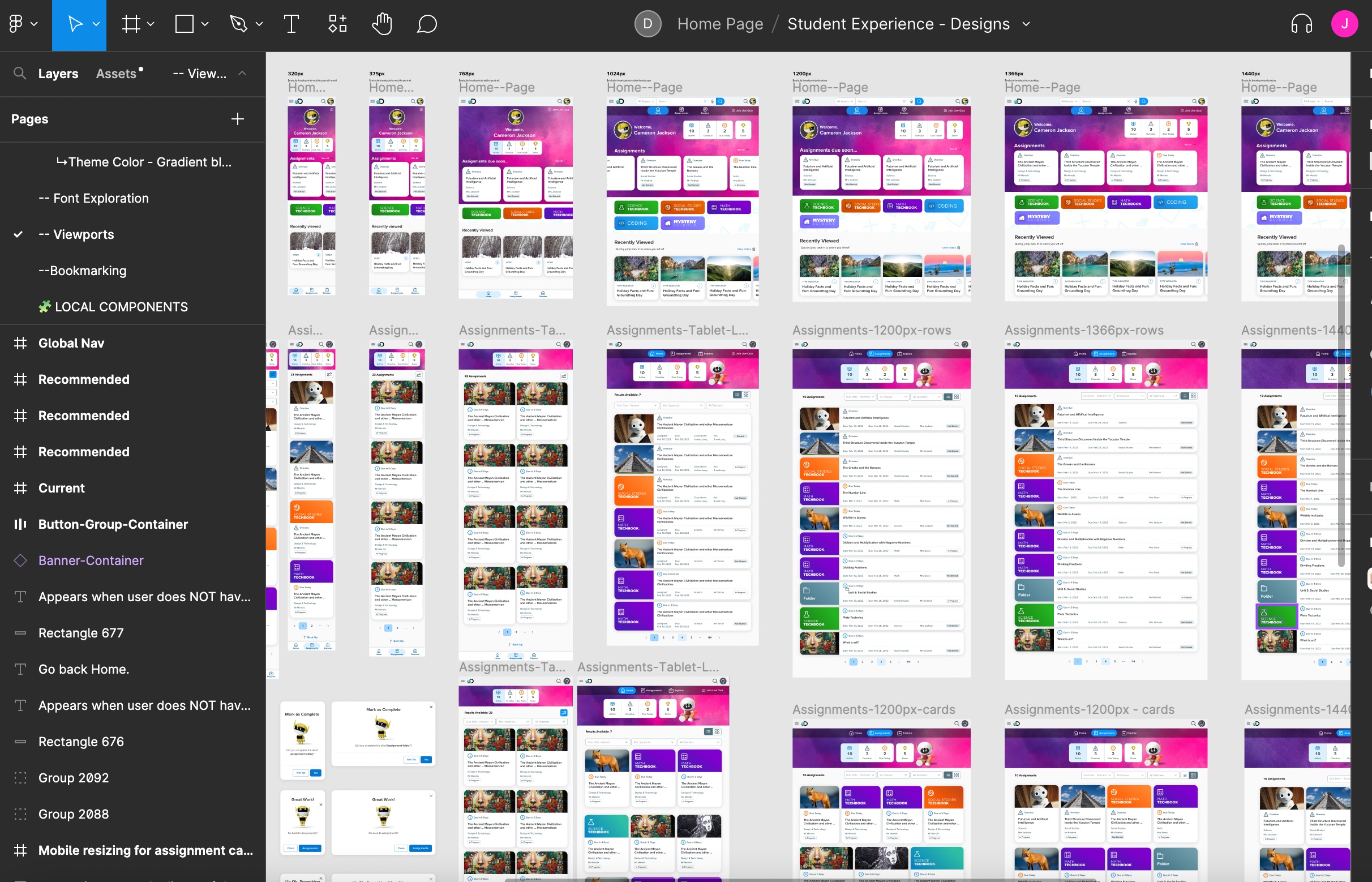
Now that we had a clear direction I began the solutioning phase of the process. If you think about the double diamond design process this is when I crossed over the event horizon into the second diamond. I started to think through the architecture of this new student experience. I then moved onto wireframing or creating quick thumbnails of general layouts. During this time I consult product managers, devs, and other designers to get feedback on my design work.
User Testing
I was fortunate enough to work with a senior UX researcher to help conduct the studies. While she only asked for my broad questions, I went a step beyond and wrote up a Usability Testing Guide for my prototype (basically what questions I had per area). While I have moderated usability studies in the past, this was done by an outside firm and collated into the slides below.
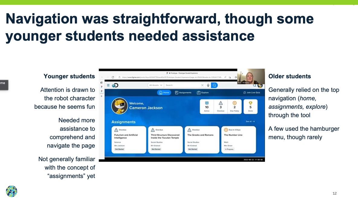
Feedback & Iteration
This is essentially the feedback loop that most companies get to complete X number of times depending on resources. We aren't Apple so sadly we were only able to conduct two rounds of usability testing. This was plenty given that the experience simple and straightforward and some products I've worked on barely get that (due to company resources). I believe you catch about 80% of the big errors in these studies so I find them highly valuable (even more so if I can be actually in the room observing or moderating). From each round we caught areas to review and rethink our solutions. I created a large table to capture all of these so that we could later review and prioritize for improvements. At some point you have put the pen down and submit the test. We were ready for release!
Key Changes: Past & Present
We released a stunning improvement to the previous design that had teachers excited and motivated for the back to school season in 2022. But the real test was how the kids would respond. Below are some of the key changes we made.
- Improved overall aesthetic: More modern look and feel, playful but not too juvenille for our target 3-6th audience (a difficult balance).
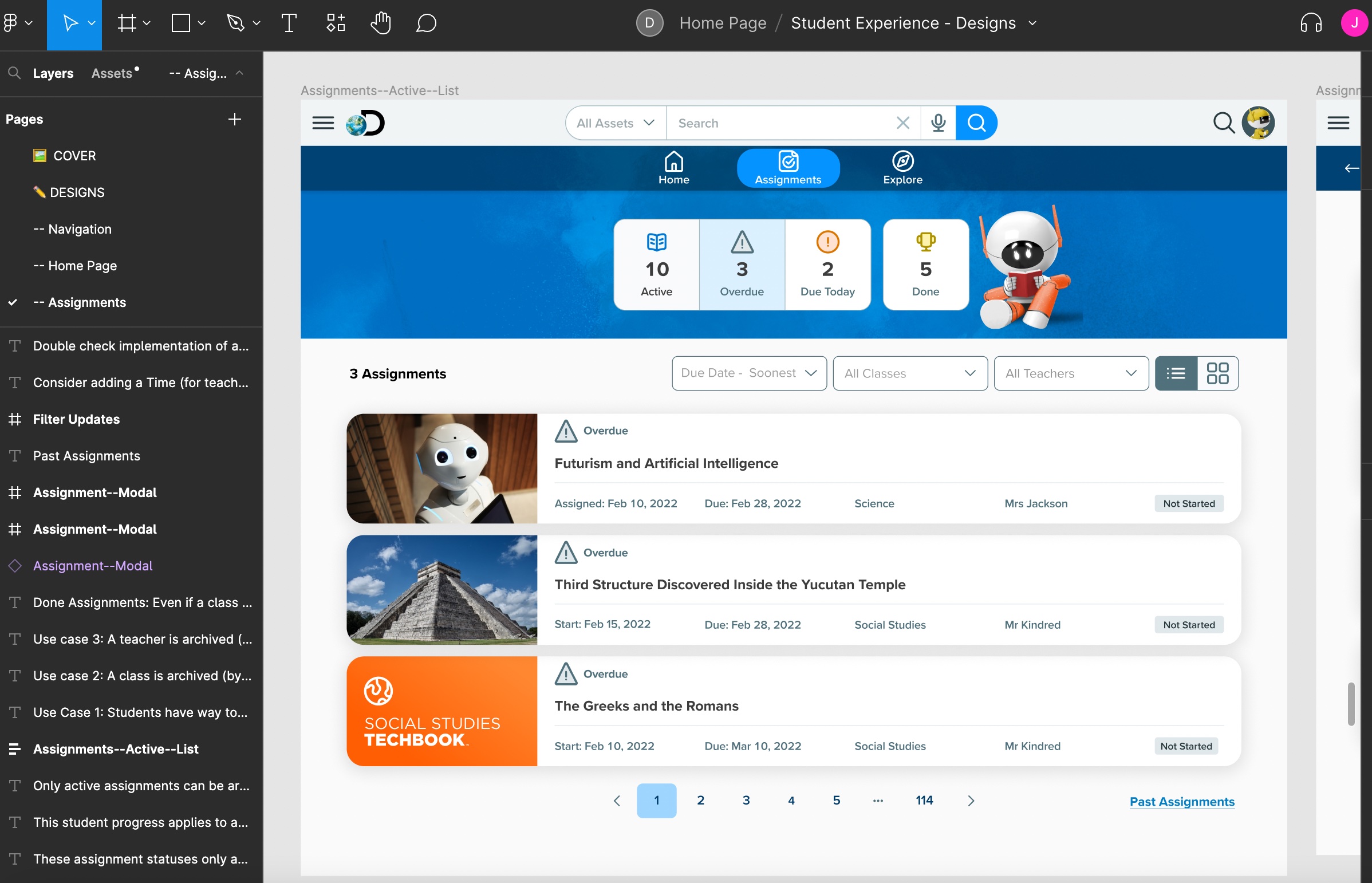
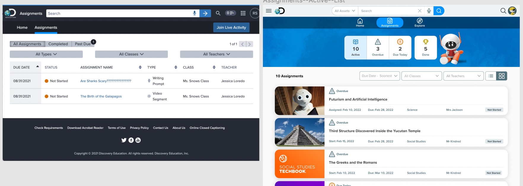
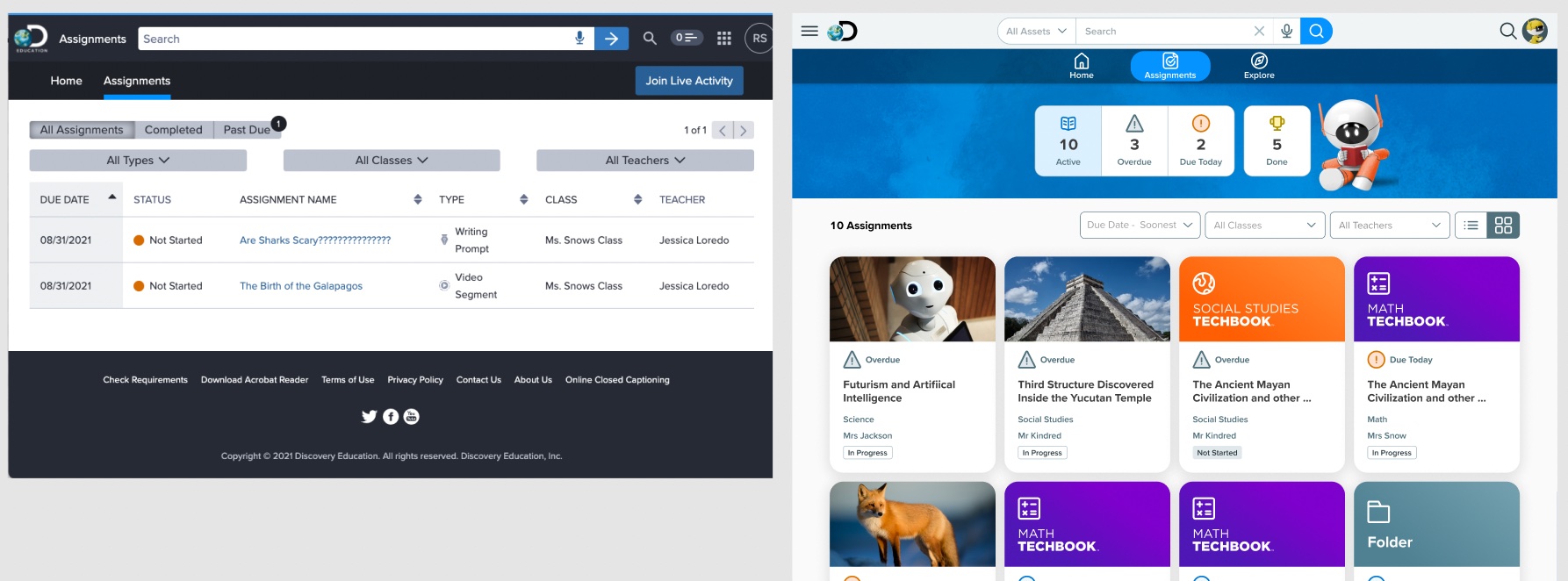
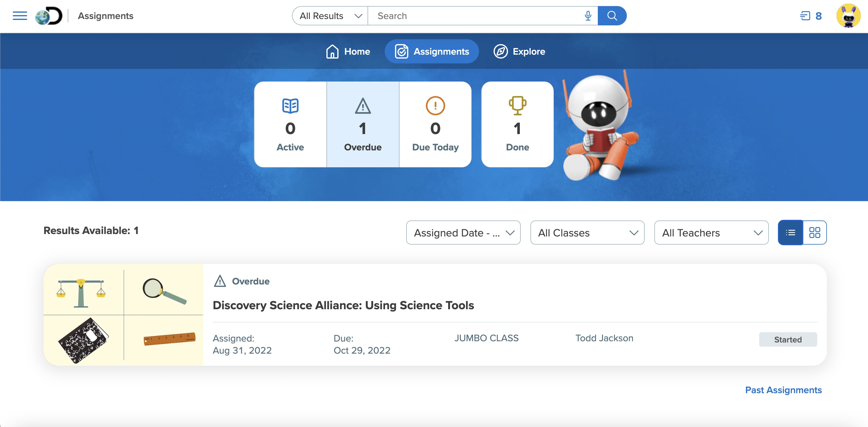
- Updated the assignment workflow so that students have better understanding of what needs to be done first, helping them prioritize and locate their assignments quickly!
- Revitalized the navigation/top bars to be simpler and easier to navigate.
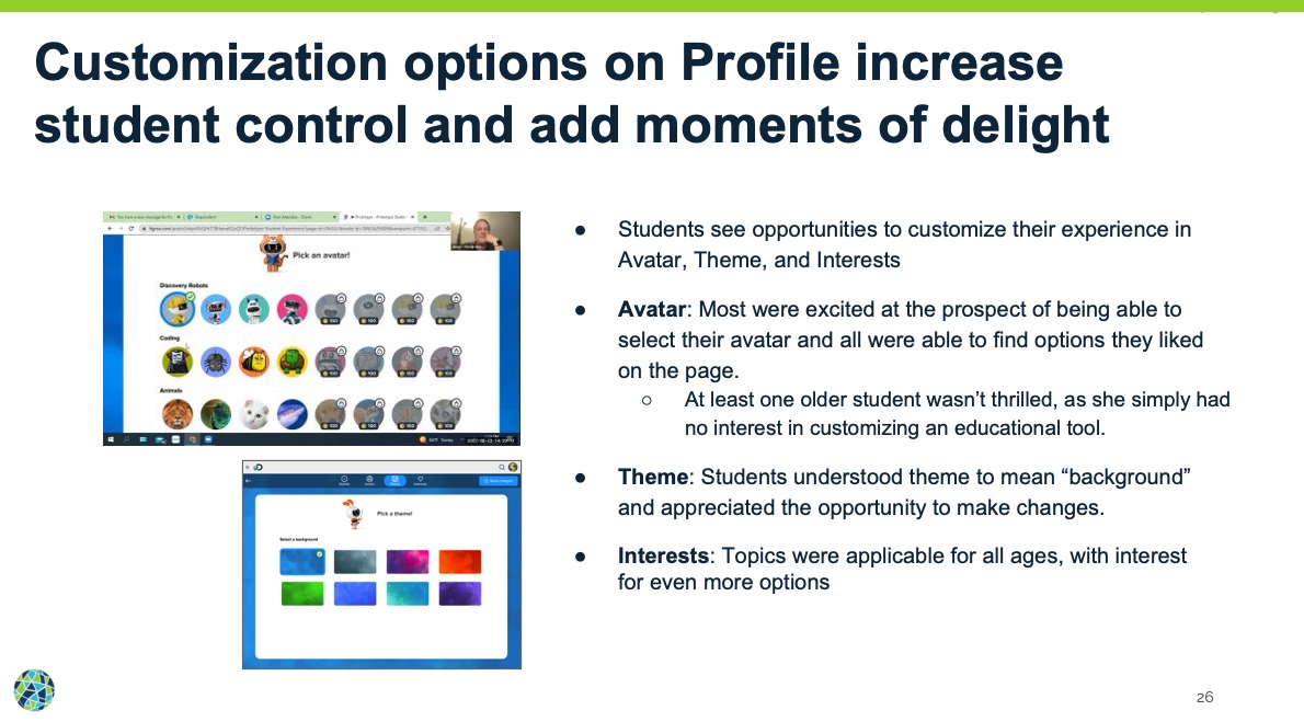
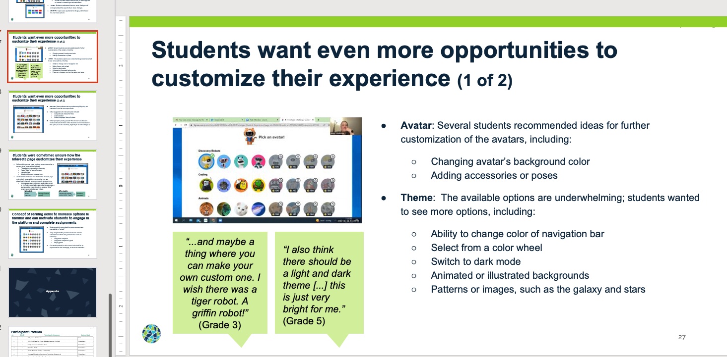
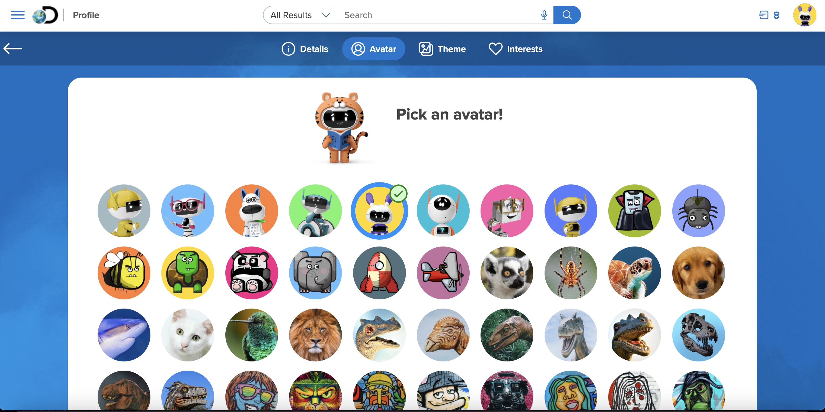
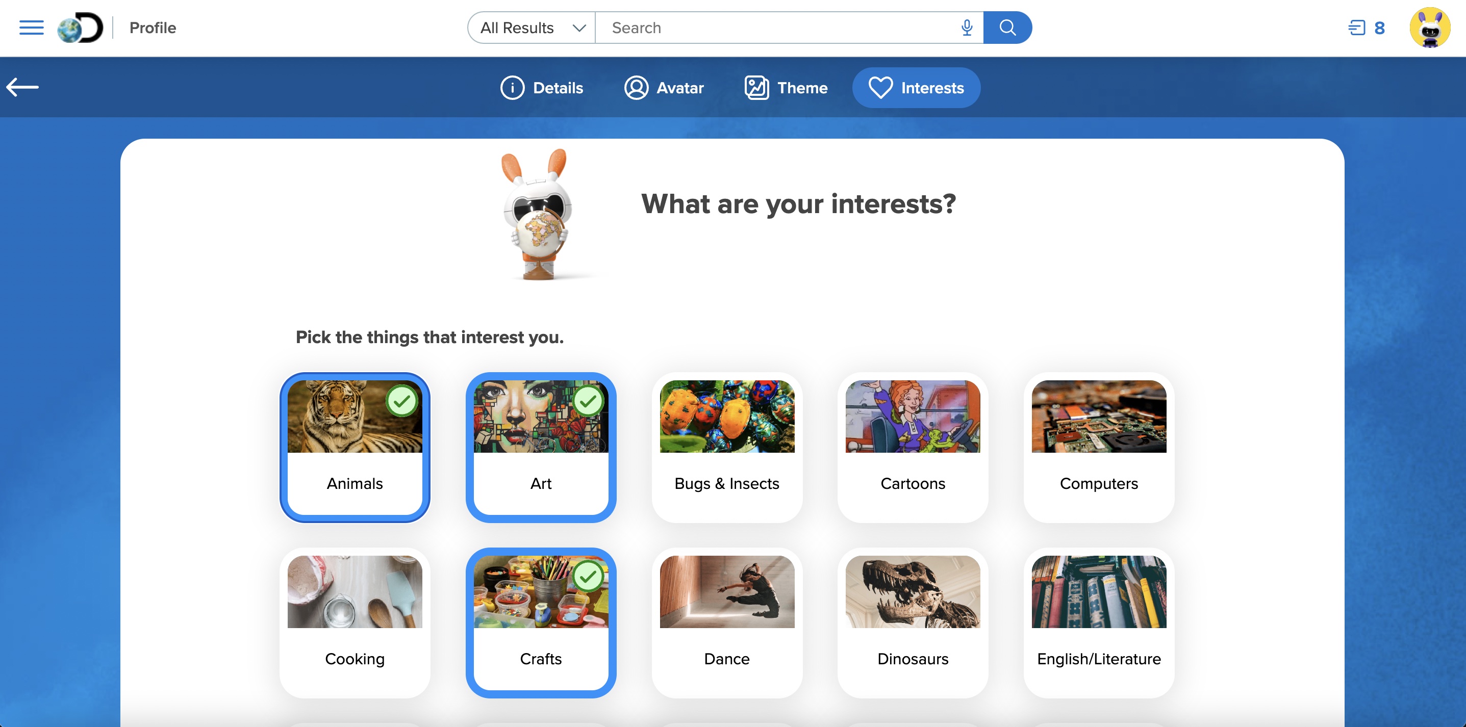
- Introduced brand new engagement features like Student Profile Page, Avatar, Theme, and Interests selection, and celebratory modals encouraging and motivating students for completed activities.
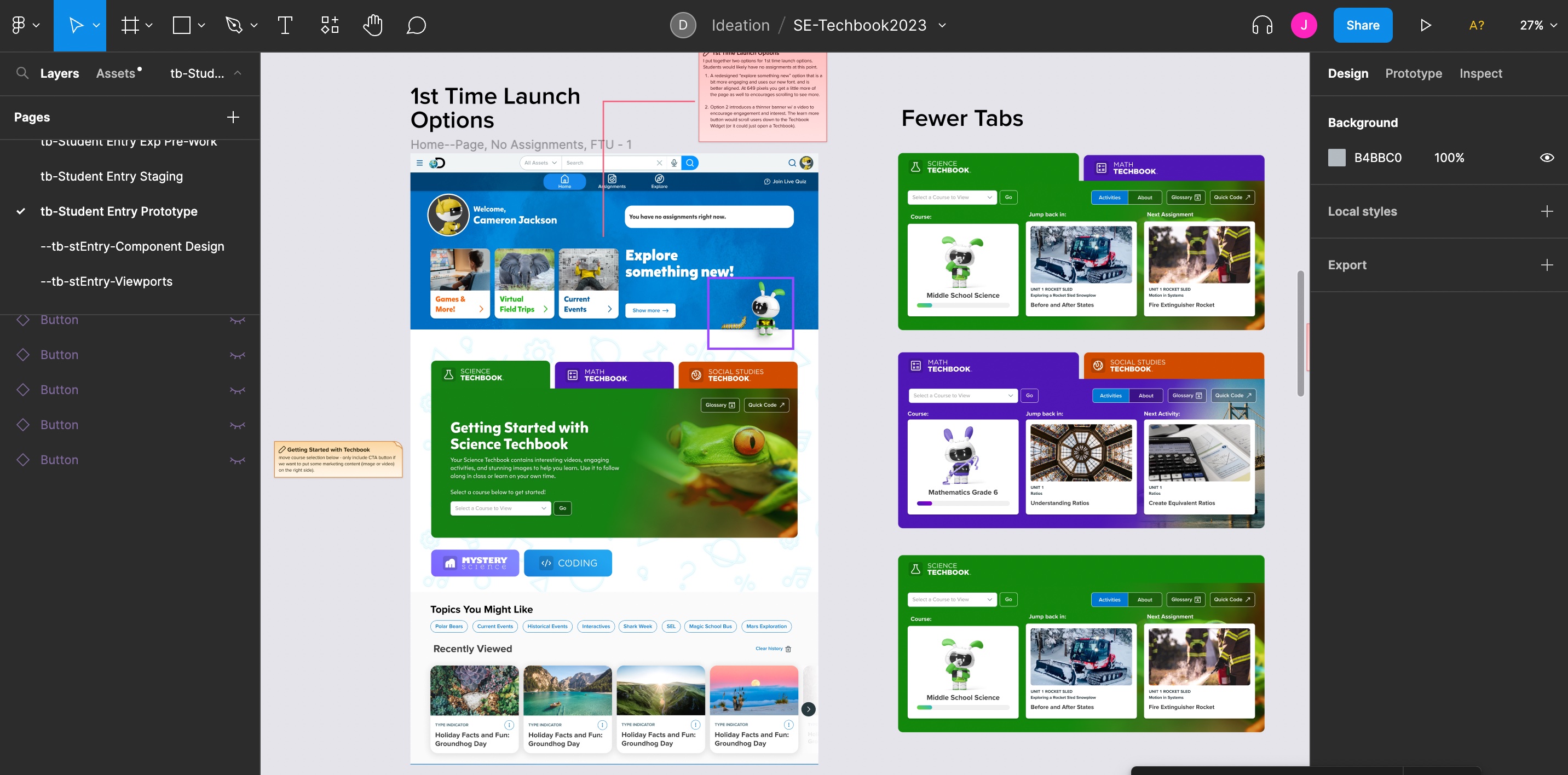
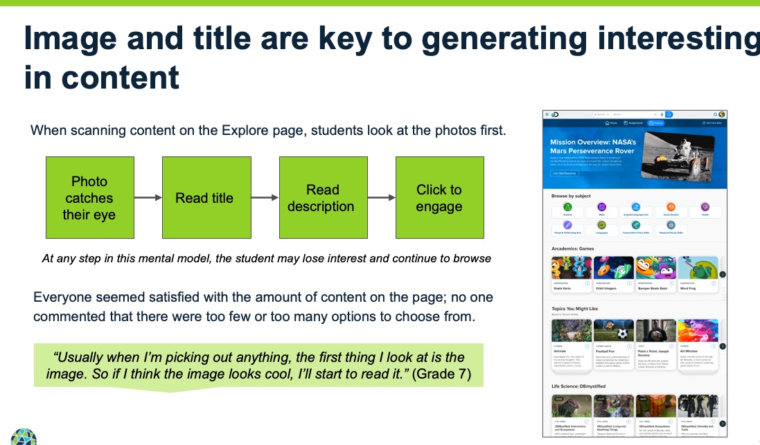
- Created brand new "browse" feature that is focused and individualized to a student's interests and browsing activity within the platform.
- Refreshed the curriculum pack (they are like apps) section by increasing visibility of primary or often used apps like their digital core textbooks. Updated the other apps with more modern aesthetic and branding.
- A new feature was pitched called Missions which at the time of this writing is in it's early phases but also produced excitement in all of our user studies (that was the first place they went as it felt more like a video game or interactive activity).
- Planned for an update to the search feature for next release.
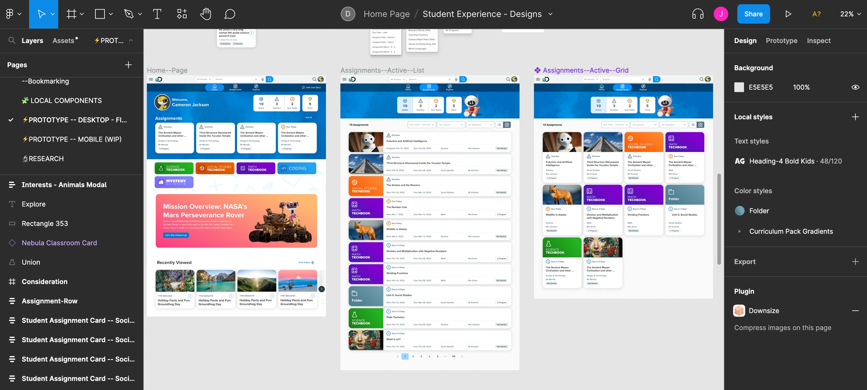
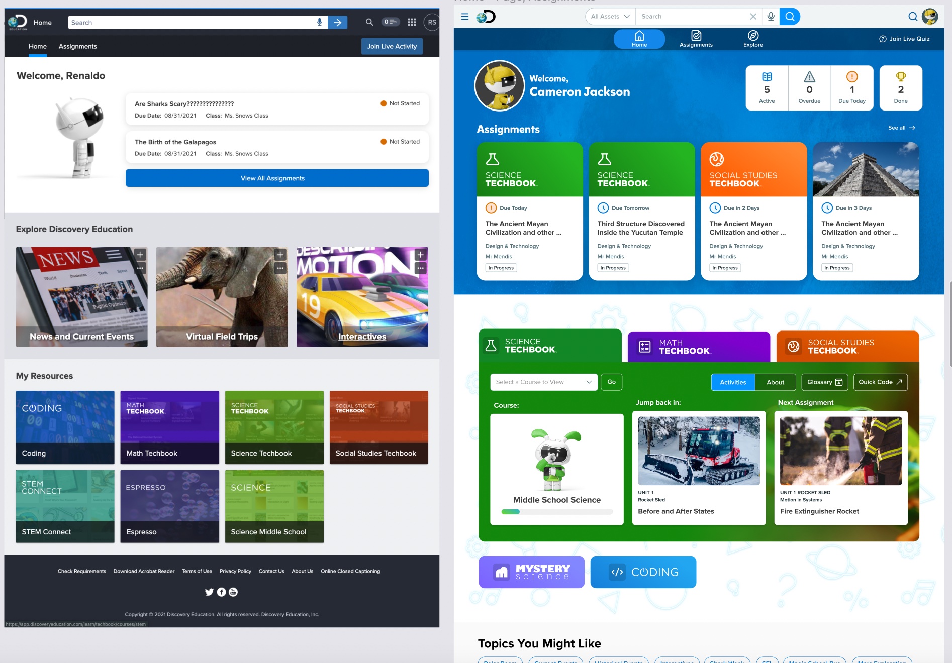
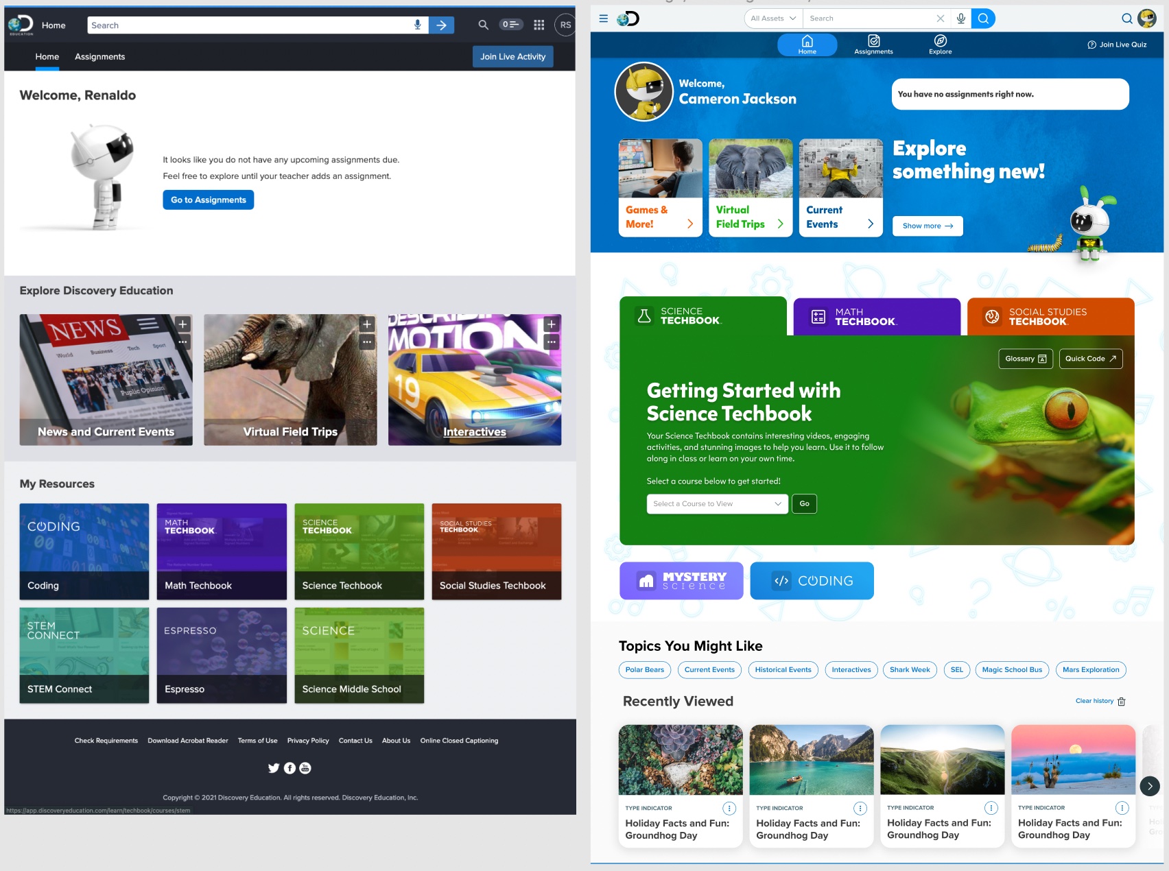
Final Designs
Here are a few screen grabs from my design files versus the live production view.

Final Thoughts
I always track metrics (KPI's or performance metrics) following a release. I saw a spike in student engagement (about a 15% increase in usage a similar increase in repeat visits) with a particular focus on the new Explore page. The qualitative feedback I got from educators who tested beta versions was overwhelming positive as was internal company stakeholders. Like most designers I get to the end of a project and reflect on what went well, what went wrong, and where should I go from here?
I believe what went well was how quickly our team adapted to working together even though there was turnover of critical roles and our timeline got condensed due to uncertain resource allocation. That being said, uncertain resource allocation really hurt our timeline and ability to ideate early on as a team. I think it's important for the full team to be involved as early as possible because I feel it helps with buy-in. I also appreciate getting opinions from people outside of my field - always a new perspective. So overall, I found our team work fantastic and I feel like the results speak for themselves.
There are always areas to improve on and plenty of ideas that I didn't get to explore due to timelines and budgets. From here we look at increasing engagement by adding Missions, a game framework to entice students to stay in the platform (learning) for longer, continue to improve on the navigation and usability particularly for the K-2 experience.
It was a pleasure to be able to make the massive improvements that we did given how new everything was for both me and my team. We are continuing to track data after the release of these features (August 2022), so we have less than six months data but it looks promising in terms of meeting most of our KPI's. We look at things like overall retention, repeat visits, increased time on platform, usage of new engagement features, and qualitative feedback. Thus far the numbers have moved modestly but have improved. It's difficult to compare to last year (or few years) due to the pandemic affecting a lot of these metrics but I look forward to analyzing the data and continuing to iterate to deliver the best possible experience for our students!