Jessica Loredo • Discovery Education • December 2022
What if a learning platform felt as intuitive and engaging as the apps students love? In this case study, I’ll walk you through how we transformed a complex system into an experience designed for clarity, motivation, and ease of use.”
The Problem
The student experience lagged behind the educator experience, feeling unfocused, flat, and disconnected. With most users in grades 3-8, the lack of differentiation between kindergarteners and high schoolers led to usability challenges. Additionally, engagement and repeat visits were lower than desired.
The Approach
I focused heavily on understanding the problem space before jumping to solutions. Some key questions that guided my process:
- Who are our students, and does the platform effectively serve them?
- What are their biggest pain points?
- How do we compare to competitors and where do we want to position ourselves?
- What are our key success metrics?
This foundational research helped us focus on usability, engagement, and student retention.
Research & Strategy
We also conducted a deep dive into the student experience through:
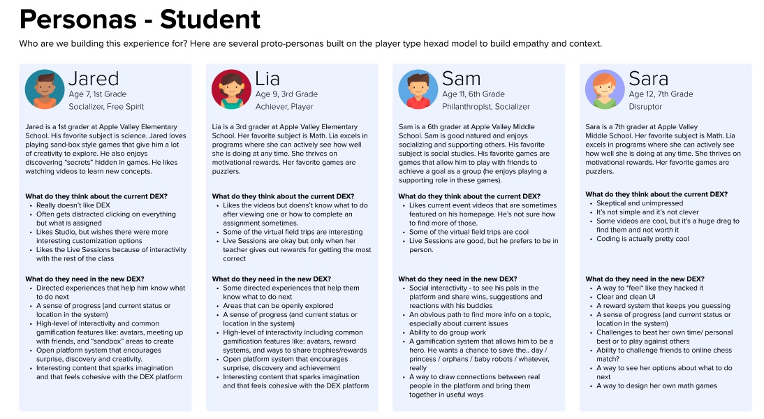
- Proto-Personas – Targeted 3rd-6th graders as the primary audience based on usage data.
- Competitive Analysis – Benchmarked against platforms like SeeSaw, Khan Academy, and YouTube.
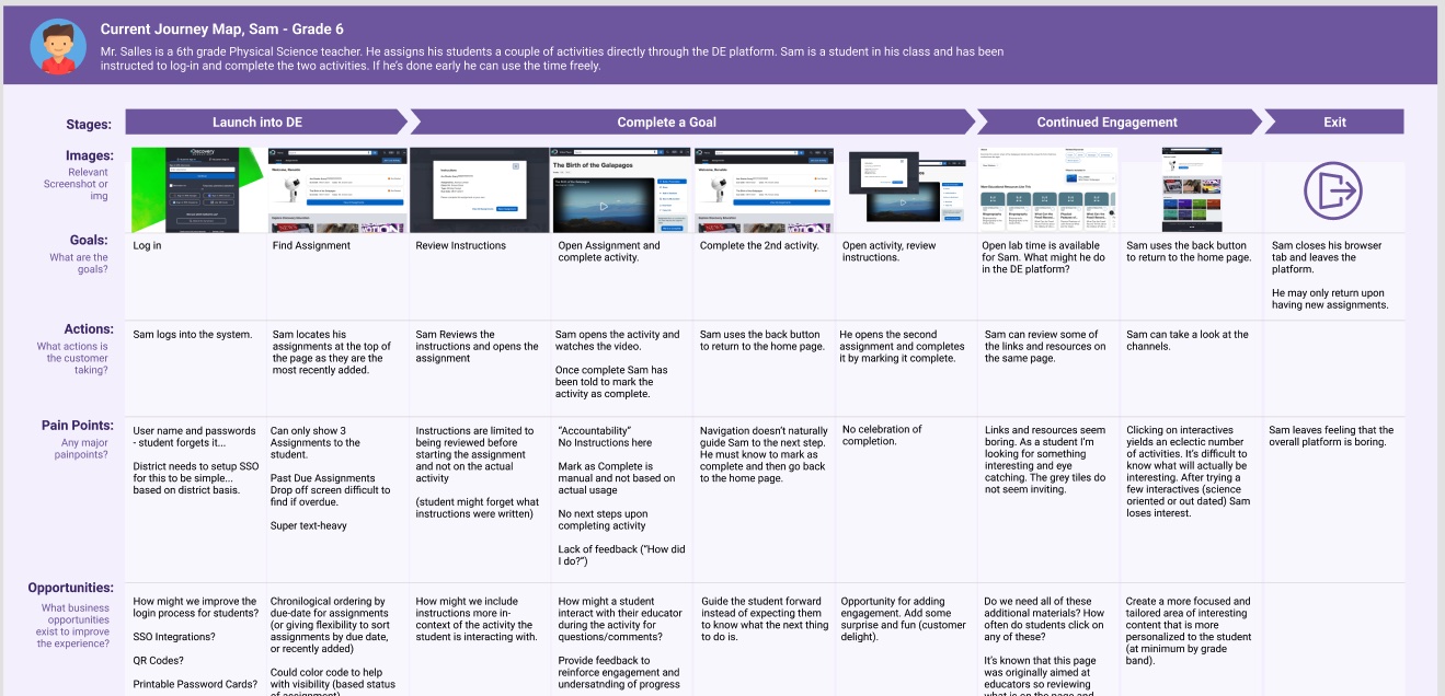
- Journey Mapping – Identified friction points in the student flow.
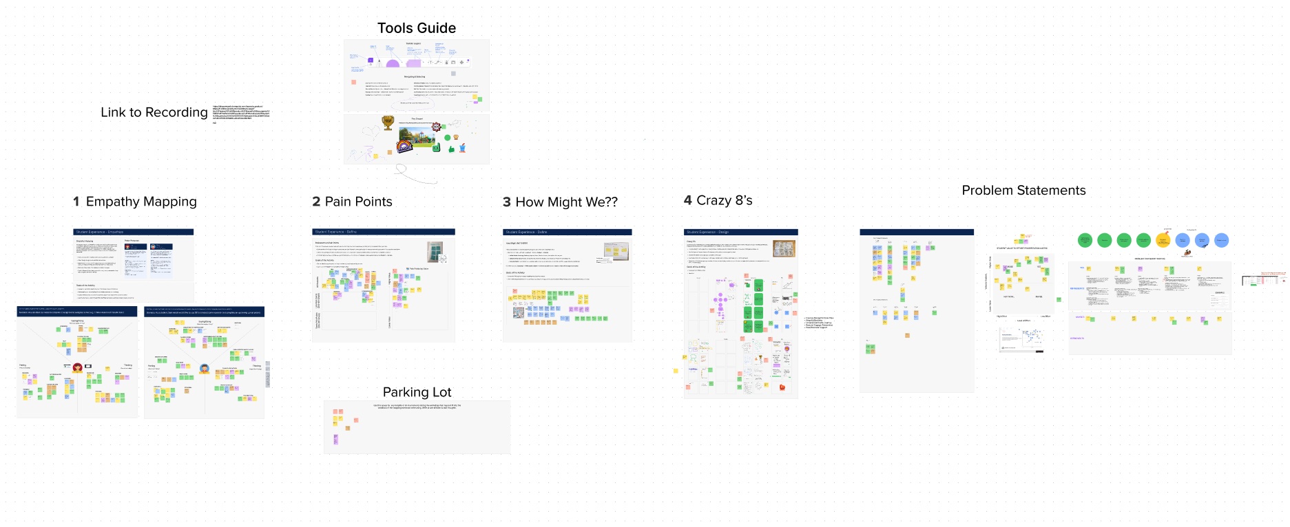
- Heuristic Evaluation – Assessed usability gaps, accessibility issues, and friction points in navigation.
- Design Workshop – Collaborated with cross-functional teams to uncover internal and external challenges.
From these insights, we refined our focus to three core pillars: Purpose (clarity), Usability (ease of access), and Engagement (student motivation).
Constraints & Challenges
- High Team Turnover: In just three months, I worked with three different product managers and saw multiple designers leave.
- Tech Stack & Scope Limitations: The engineering team was new to this product, and significant design changes weren’t feasible.
- Existing Design System: The platform was optimized for educators, not students, requiring creative adaptations.
Design & Prototyping
With research guiding us, we iterated through:
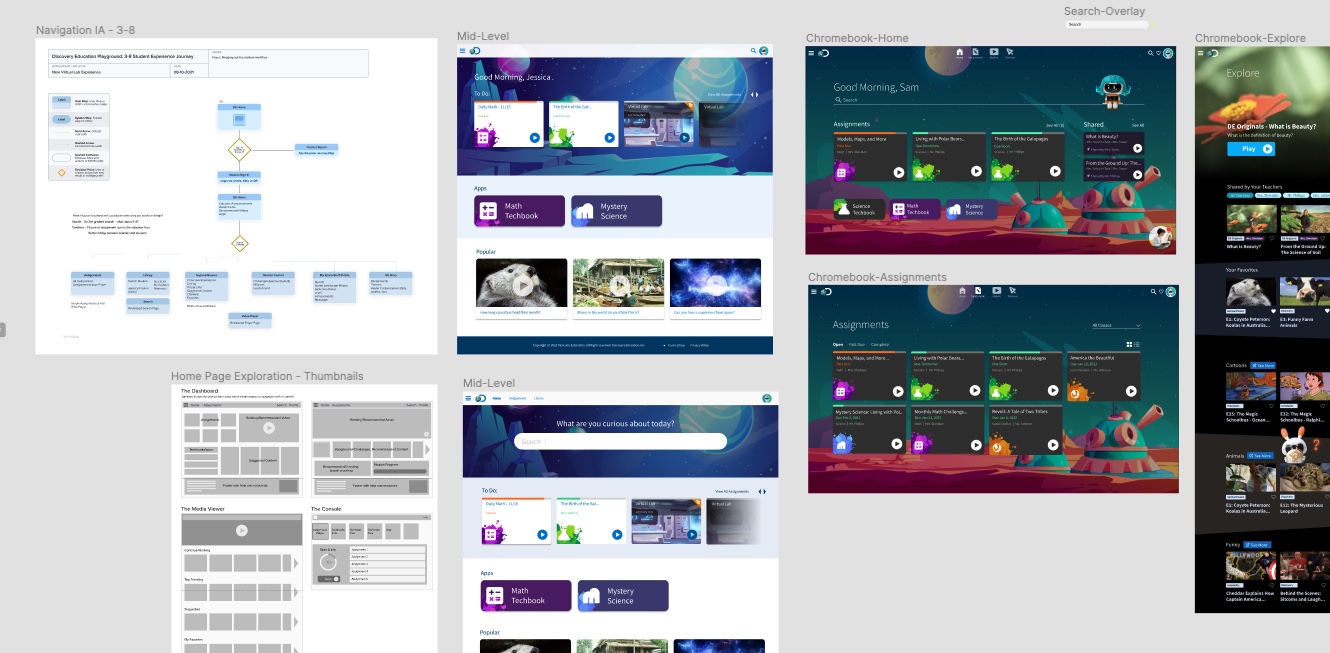
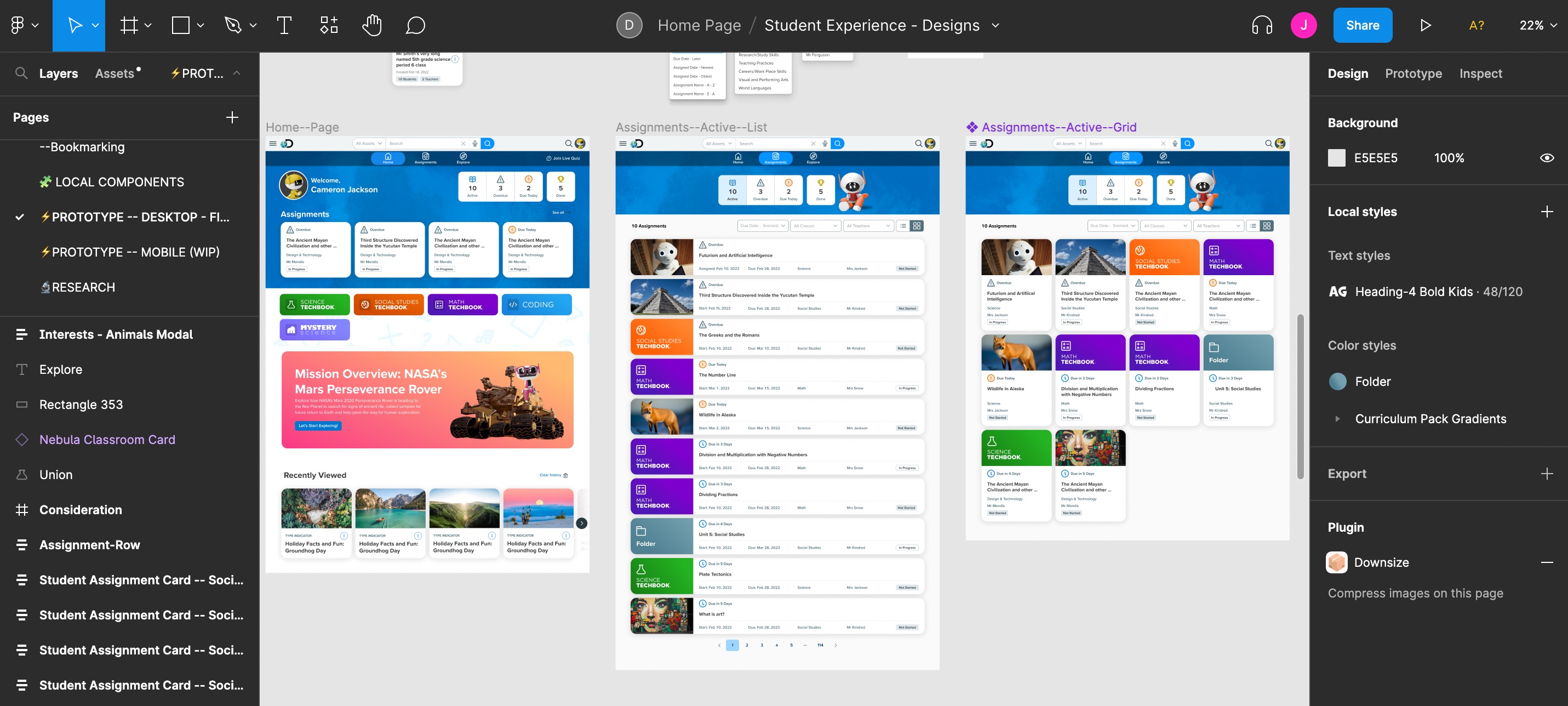
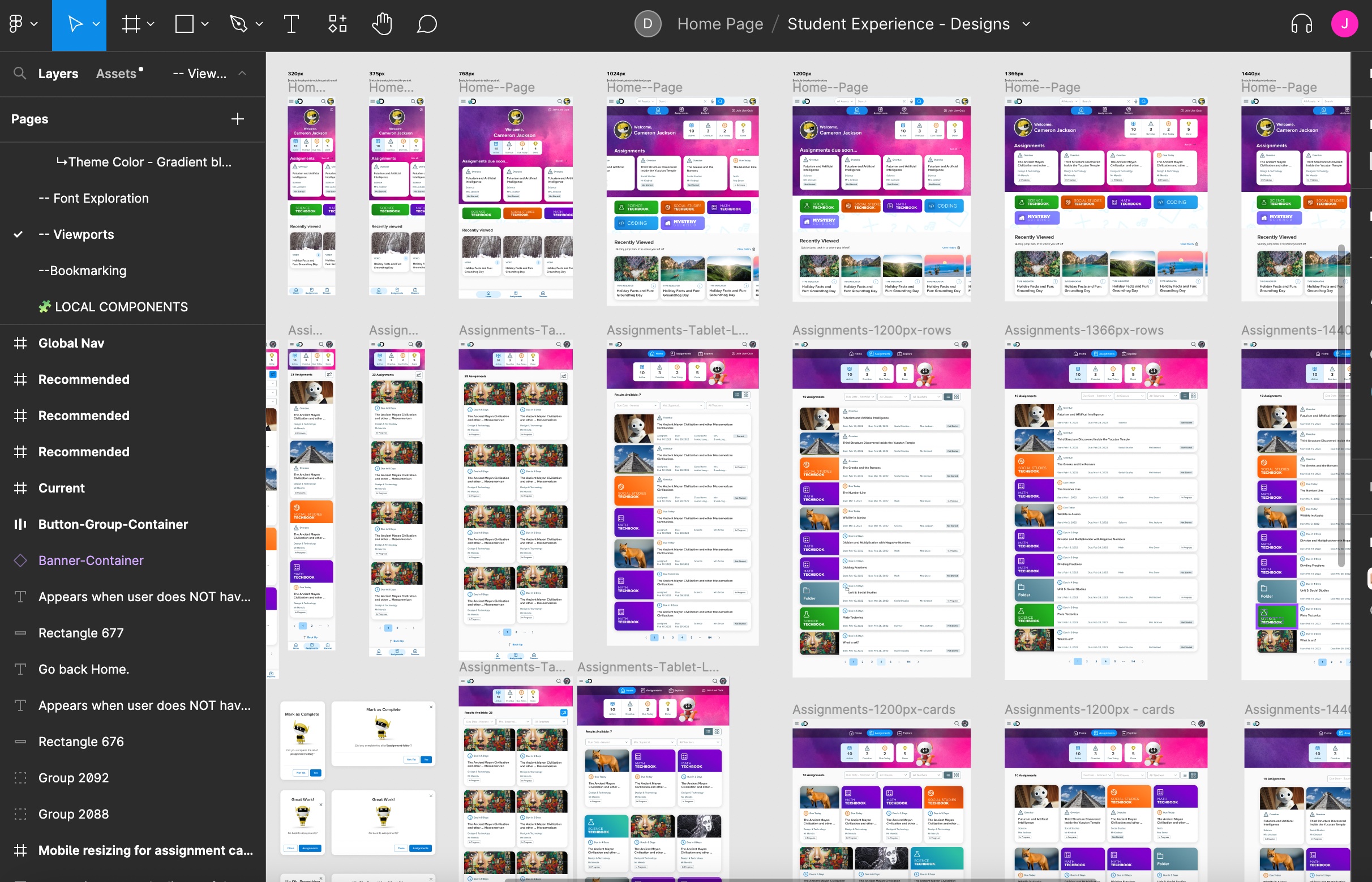
- Information Architecture & Wireframes – Streamlined navigation and workflows.
- High-Fidelity Prototypes – Modernized UI with engagement-driven features.
- Usability Testing & Iteration – Validated and refined designs with real student feedback.
Key Improvements
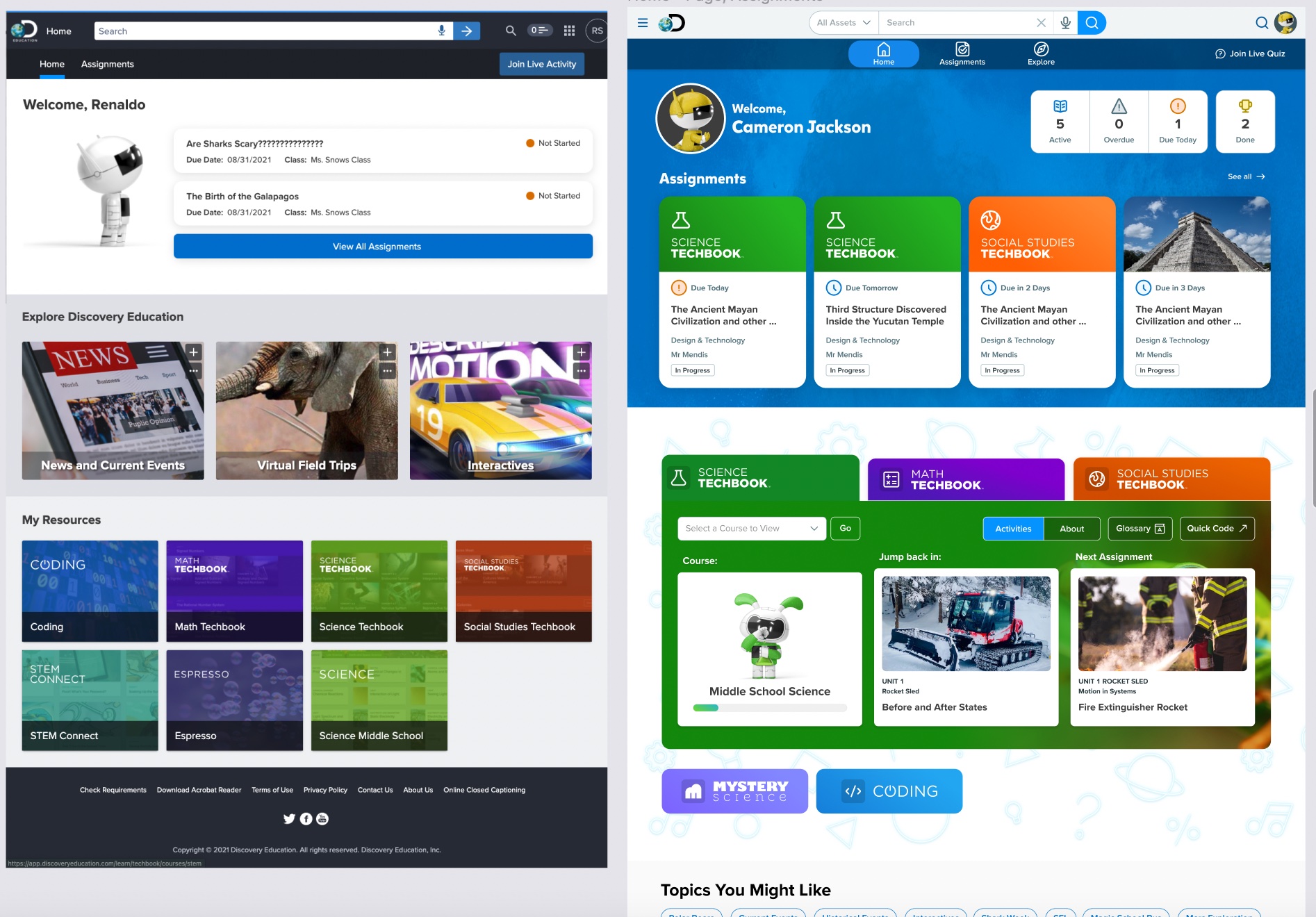
- Revamped Home & Assignment Pages – Clearer hierarchy and navigation.
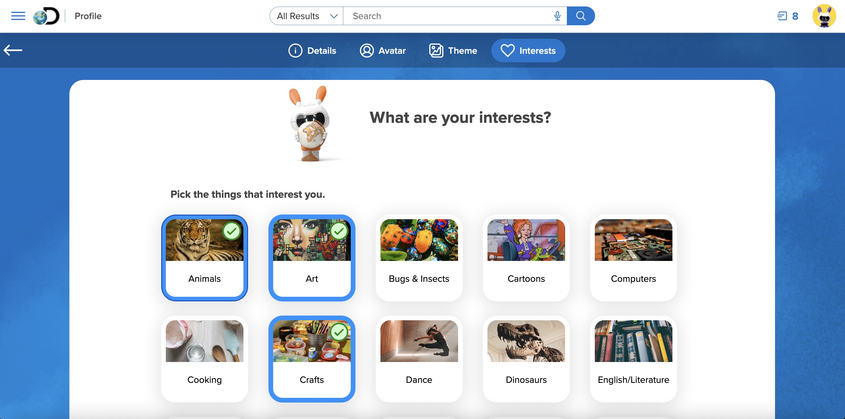
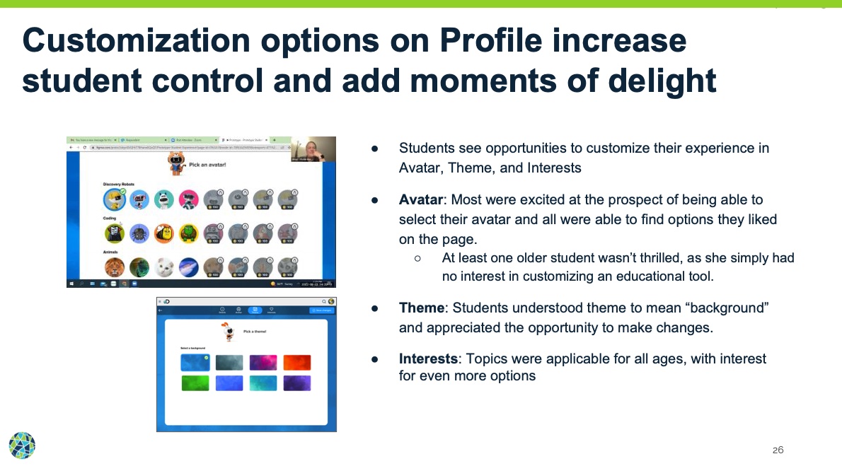
- Personalization Features – Student profiles, avatars, themes, and achievements.
- New Explore Section – Encouraged discovery and engagement.
- Improved Accessibility – More intuitive K-12 interactions.
Results & Impact
We conducted usability testing during our project to continue to iterate and validate our designs. Through feedback we further improved the navigation and found that students were elated at the new customization options. These features were not originally scoped, and as a designer, I had to fight for adding these engagement features and I’m so glad I did!
After months of research, iteration, and collaboration, the redesigned student platform launched to overwhelmingly positive feedback from both educators and students. The final release introduced a cleaner, more engaging experience that not only improved usability but also made the platform feel more welcoming and student-friendly.
- Increased Student Engagement: A 15% increase in overall usage and repeat visits, with students particularly drawn to the new Explore page.
- Improved Usability: The refined assignment workflow significantly reduced confusion, making it easier for students to locate and prioritize their tasks..
- Stronger Personalization: Features like custom avatars, themes, and interest-based content recommendations provided students with a greater sense of ownership over their learning journey.
- Refined Navigation: The platform’s navigation and top bar were redesigned to reduce clutter, simplify interactions, and create a more intuitive experience.
- Educator Enthusiasm: Teachers responded positively, citing better student focus, improved motivation, and increased interaction with assignments.
The most exciting part? The early data showed promise for even greater impact, and the success of the redesign set the foundation for future innovation within the platform.
Reflection: Lessons, Challenges, and Looking Ahead
Reflecting on this project, one of the biggest takeaways was the power of adaptability. The team had to navigate major shifts—frequent leadership turnover, changing development constraints, and evolving project goals—yet still managed to launch a product that meaningfully improved the student experience.
What Worked well:
- A deep focus on research and problem definition helped ensure that design decisions were addressing real user needs.
- Cross-functional collaboration between UX, product, and engineering led to a more holistic and well-rounded solution.
- A student-centered approach guided every decision, keeping engagement and usability at the forefront.
What could have been better:
- Early alignment on scope and technical constraints might have prevented some late-stage pivots.
- More iterative testing with students—especially younger users—would have provided deeper insights into their specific usability challenges.
- Some features had to be deprioritized due to time and resource constraints, leaving future opportunities for continued improvement
Next Steps
The launch was a major step forward, but the journey doesn't end here. Future improvements will focus on:
- Expanding game-based learning features like Missions, which tested well and have the potential to increase long-term engagement.
- Refining the navigation further to improve the experience for younger students (K-2).
- Continuing to track performance data to refine engagement strategies and iterate based on real-world student behavior.
The success of this project proves that great design can transform learning experiences, and the insights gained will shape future iterations of the platform.
Want to read more? You can read the full case study published on Notion
Full Case Study arrow_forward